Börse im Team | Corporate Design für Investment-Community

Börse im Team

LOGO-ENTWICKLUNG   I   CORPORATE IDENTITY   I   DIVERSE WERBEMITTEL

Der Markenauftritt für Börse im Team schafft eine eigenständige visuelle Identität für eine moderne Investment-Community. Logo, Corporate Design und Kommunikationsmittel greifen zu einem klaren Erscheinungsbild zusammen, das Offenheit, Austausch und Gemeinschaft in einer prägnanten Designsprache zum Ausdruck bringt.

An abstract logo forms a star/snowflake-like shape with one arrow in teal green pointing right and five other arrows in light brown pointing outward.
The logo for "Börse im Team" features a star icon with four arrows, two dark green and two light brown, followed by the text "BÖRSE IM TEAM" in dark green with the slogan "TATSÄCHLICH GELD VERDIENEN. AN DER BÖRSE. IM TEAM." below it.
Börse im Team logo and text on a white background.
A dark teal banner with the text "BÖRSE IM TEAM" in white next to a gold and white asterisk-like symbol, and "TATSÄCHLICH GELD VERDIENEN AN DER BÖRSE. IM TEAM." underneath in white.
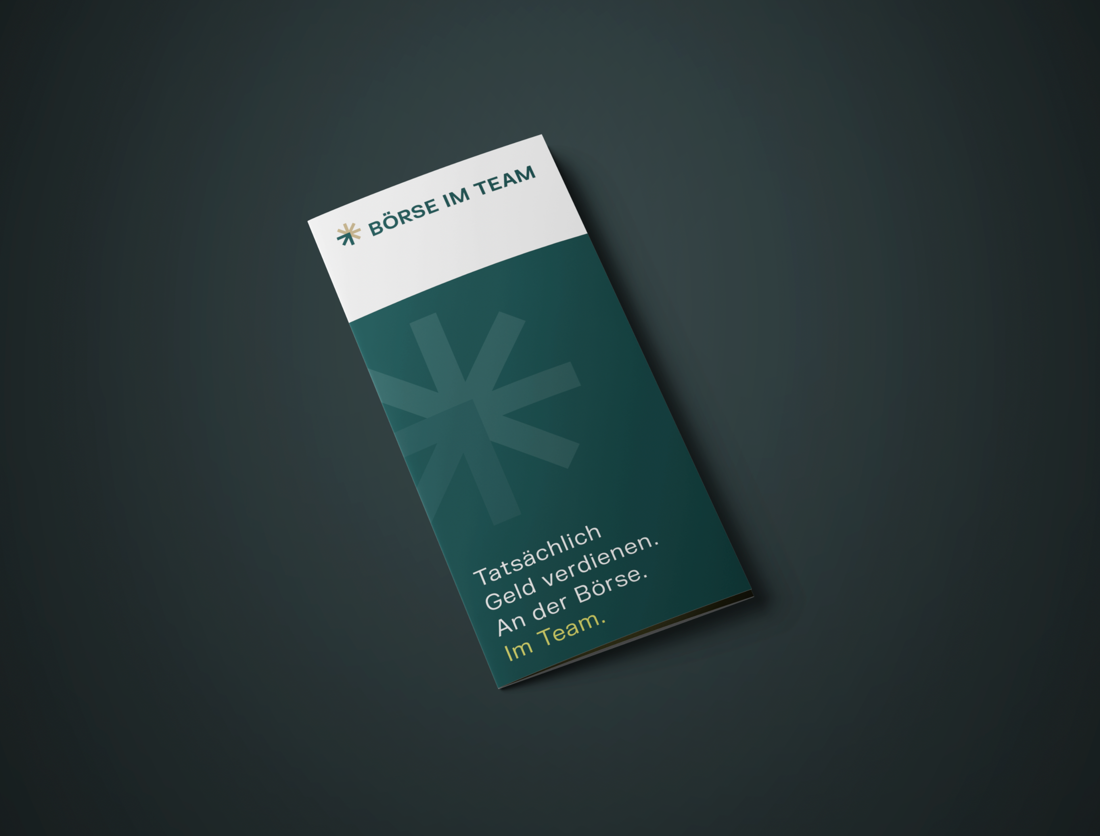
A dark green and white brochure that reads "BÖRSE IM TEAM" (Stock Exchange In The Team) and "Tatsächlich Geld verdienen. An der Börse. Im Team." (Actually earn money. On the stock market. In a team.) on a dark gray background.
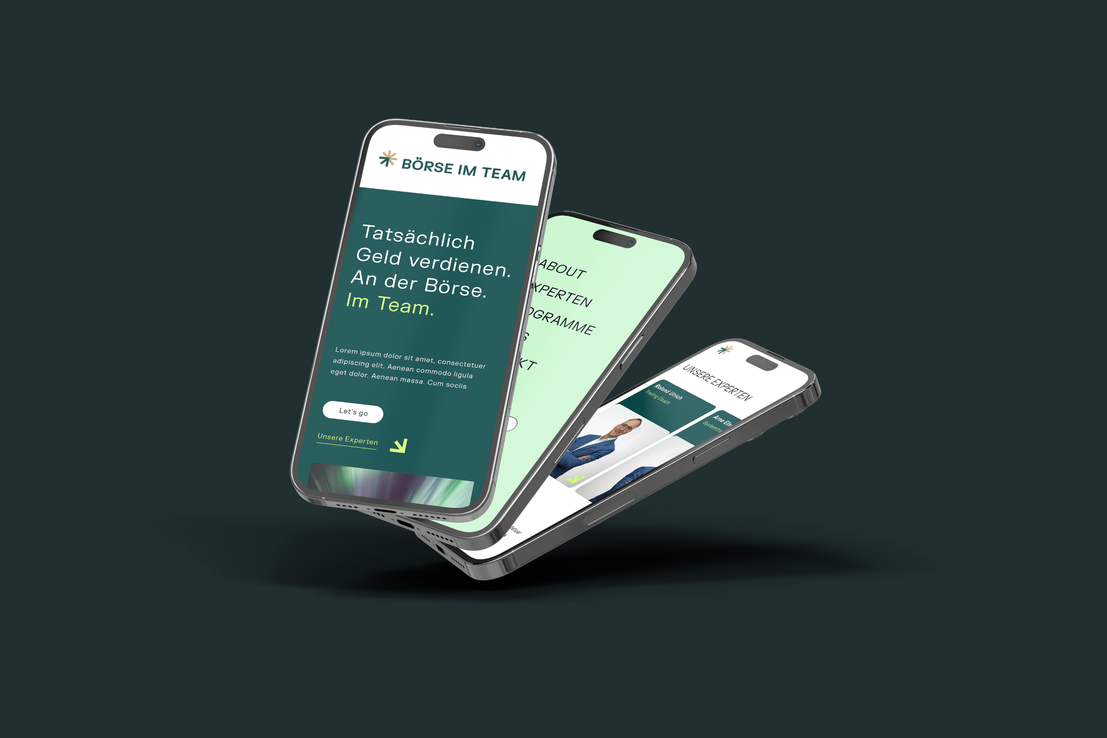
Three smartphones displaying a mobile-optimized website for "BOERSE IM TEAM" with green and white pages.
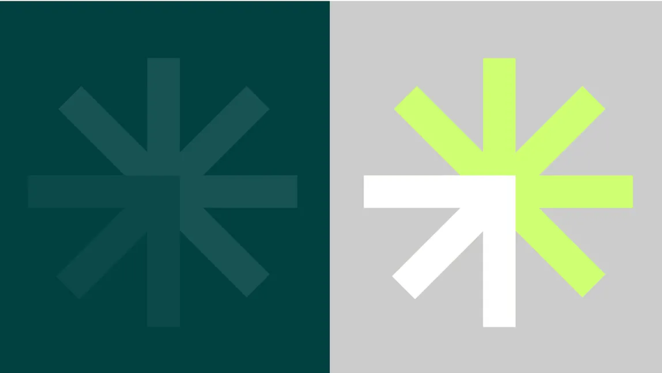
A teal and light gray image divided down the middle, with a faint teal asterisk on the left and a bright white and lime green asterisk on the right.
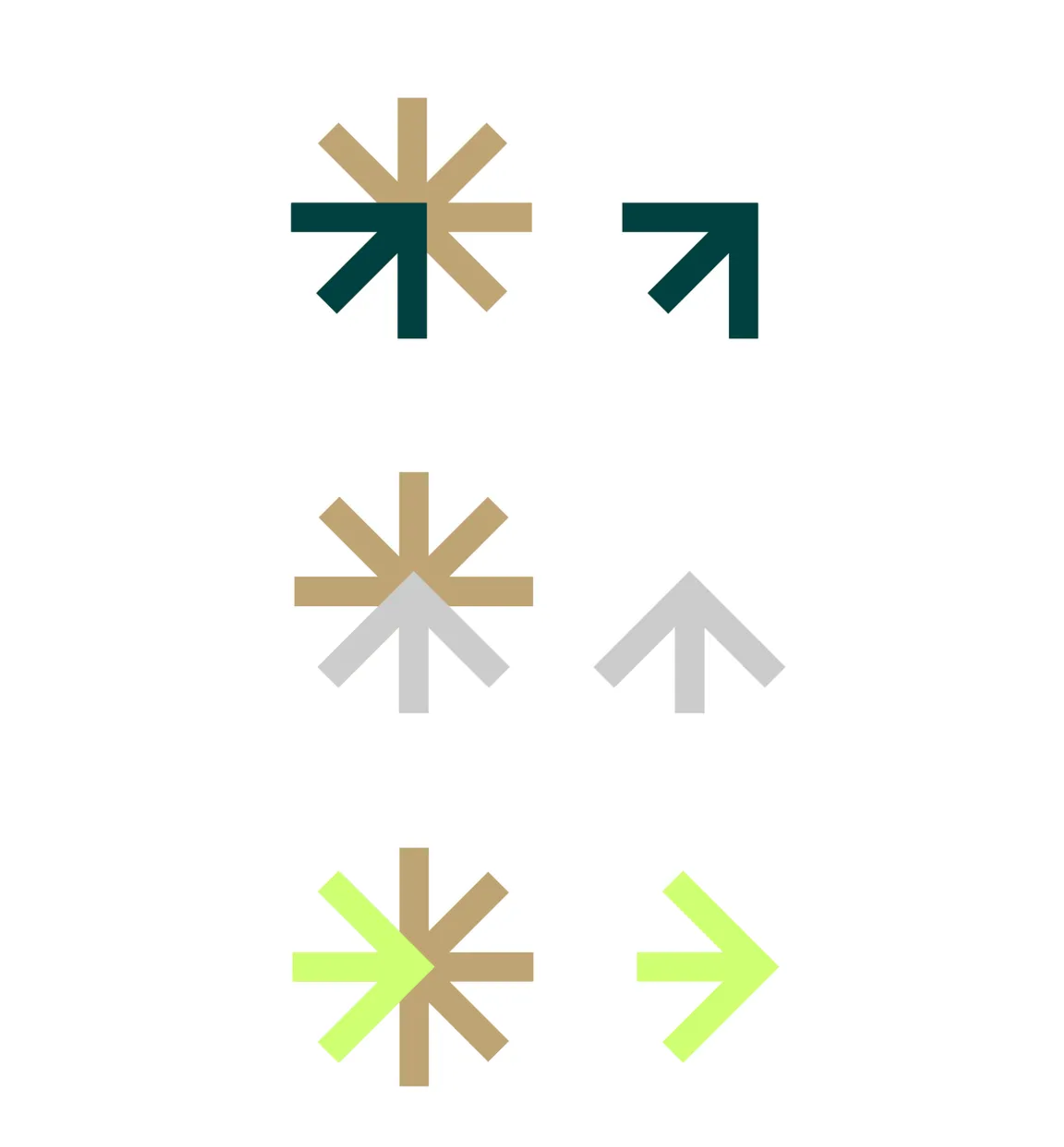
Three rows of icons, each row showing a star shape made of arrows and a single arrow, in different color schemes.
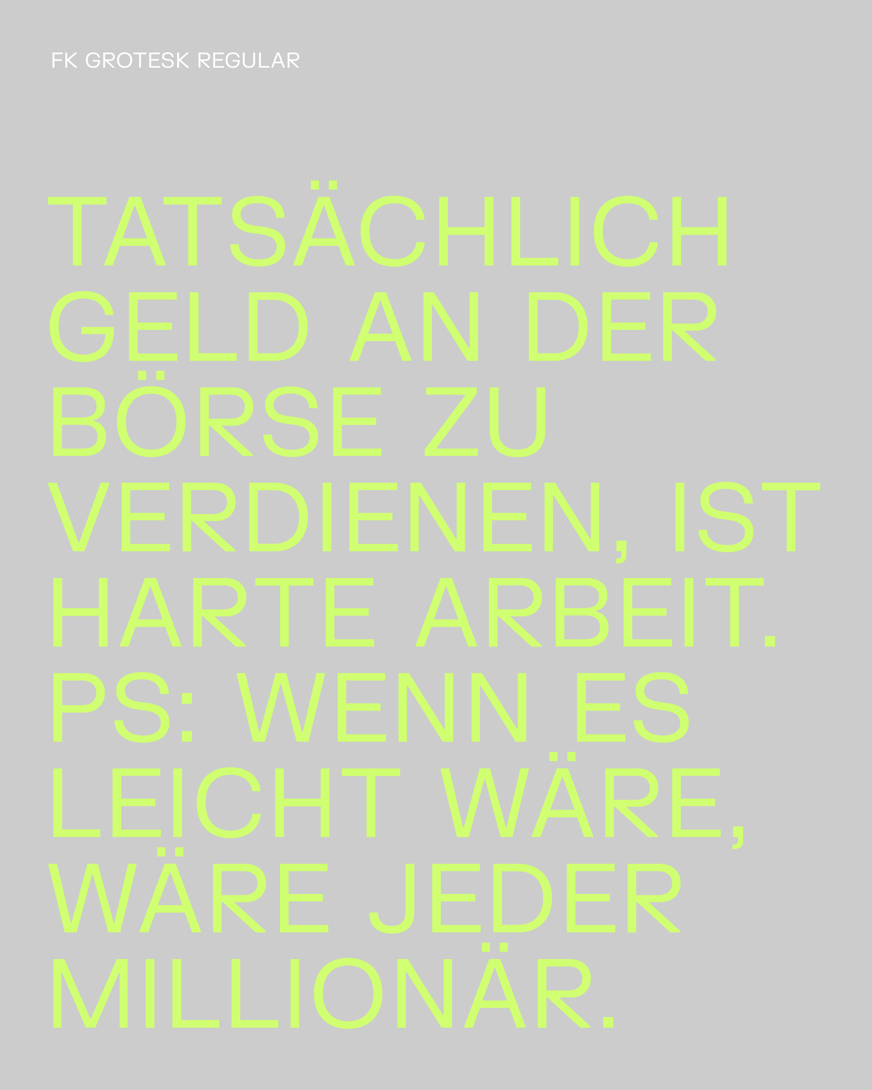
Lime green text on a gray background that reads: FK GROTESK REGULAR; TATSÄCHLICH GELD AN DER BÖRSE ZU VERDIENEN, IST HARTE ARBEIT. PS: WENN ES LEICHT WÄRE, WÄRE JEDER MILLIONÄR.